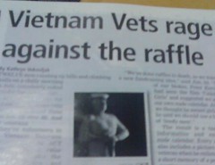
Girl Guides have been selling cookies for decades. You can be assured that Op shops will carry copious numbers of bad 80s records. School fetes always have a sausage sizzle. Vietnam veterans rally to develop a nude calendar... ...woah! What!?
Well, it was an eyebrow raiser for me as I sat flicking through the local community magazine, waiting for my cousin at the airport! What really raised my eyebrows was the title of the news story about Vietnam vets changing tack on their fundraising efforts, and going for a tastefully done (aren't they always?) nude calendar: Vietnam Vets rage against the raffle - Gotta love it!
There's a lot to be said for catchy titles and well worded taglines. It makes a huge difference to the reading experience. Magazines are a good example, especially when we turn the discussion to online forms of information, where our habit - as with mags - is to flick, browse and scan across a range of sites and screens on our desktops.
Adverts are a classic example too. Like this one below...

In this example the image and the text work together and the image is certainly not what you'd expect for a women's beauty therapy advertisement! It's tongue-in-cheek and attention-seeking, which is why it works!
I often check out the tips on Ben Hunt's 'Web Design from Scratch', when talking about writing online content with teachers. Also, checking out how formats like magazines layout information on their pages can give us a good start towards how we can design online content to grab students' attention and engage them.
It's not just the format but the experience too. The two examples above made me laugh, made me look twice and made me read more detail (although I couldn't recall the beautician for you!), and had me engaged so I had to run after my cousin as she wandered out of the building!
Hunt refers designers to A List Apart's article on learning to write which covers these points.
- User experience isn?t just visual design, and
- Text is interface.
technorati tags:interface.design, writing, content, engagement, magazines
Blogged with Flock
No comments:
Post a Comment